

Your school crest is discovered by prospective parents, students and your local community long before they contact you or your enrolment staff. It therefore plays a fundamental role in shaping first impressions of your school.
As your public face, your logo or crest should reflect your brand, communicating your school’s outlook on education and inspiring school pride. It should be enduring, professional, instantly recognisable and stand out from its competitors. It also needs to work in any size, having as much impact on a business card or badge as it does on a billboard.
Working with a designer
Engage a designer to work with you from the beginning. Provide them with a well-defined brief that focuses on the results, outcomes and business objectives (not the aesthetics) of the project. This has two key advantages:
- It compels you to fully consider the purpose of the project; what you want to achieve.
- It provides your designer with clarity in what you need them to deliver.
Throughout the process, remember that your designer is a specialist and has insight into what makes a great crest. Collaborate with them and be open to their suggestions. Provide clear feedback and establish a clear, simple approval process in order to achieve the best results.
The big picture
In order to make design decisions that will achieve your vision, start by considering the big picture — who you are and what your school’s purpose is. For example:
- Why did your founders establish the school?
- What beliefs and values are important to your school?
- What is your point of difference? What makes you unique?
- If you could express your brand in just three words, what would they be?
- What are three words you want your community to use to describe you?
Inspiration
The hardest part of the process is searching for inspiration. The first steps usually centre on collaboration and gathering ideas through brainstorming and the use of mood boards. Schedule a facilitated brainstorming session, inviting key stakeholders and representatives from across your school community. All will have a unique perspective on your brand and good ideas often come from unexpected places. An important (and challenging!) step between brainstorming and design is defining the emotions you want to connect to your brand. Create a mood board — a collage of meaningful images, text and objects that help define your brand — to address this challenge and bring things into focus.
Competitors
Next, you should consider your competitor schools and their crests so that you avoid designing something that looks too similar — you want to stand out rather than blend in. Looking at your competitors’ crests also helps create a reference point for your brand. It enables you to understand what the community believes, requires and aspires to.
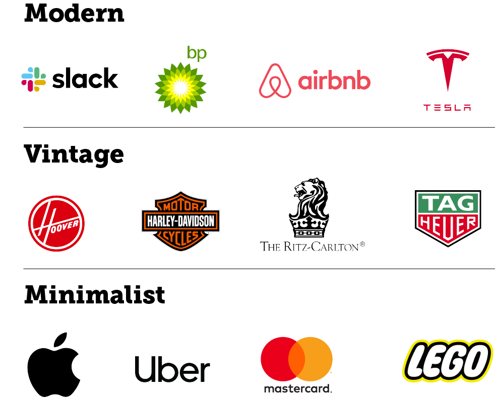
Design style
Before plunging into the nitty gritty of design, selecting a style/shape for your crest is key. You could choose a modern/minimalist style or one that is more traditional. Minimalist designs are simple and abstract, with an abundance of white space and strict omission of details (‘less is more’). The elements that are used receive extra emphasis because there’s less visual competition. Traditional crests use features that are either timeless or old-fashioned enough to be considered standard or classic. They rely on aesthetics with proven effectiveness and often include a combination of graphic and historical elements.
Once you have an idea what direction you want to take, it’s time to start converting that into a design. Many features come into play including colours, shapes, graphic elements and typography. Separating the components and looking at what they can do for your logo or crest will help simplify the process.
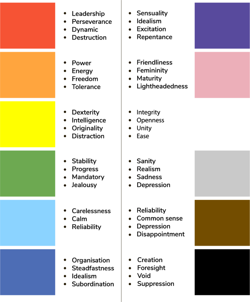
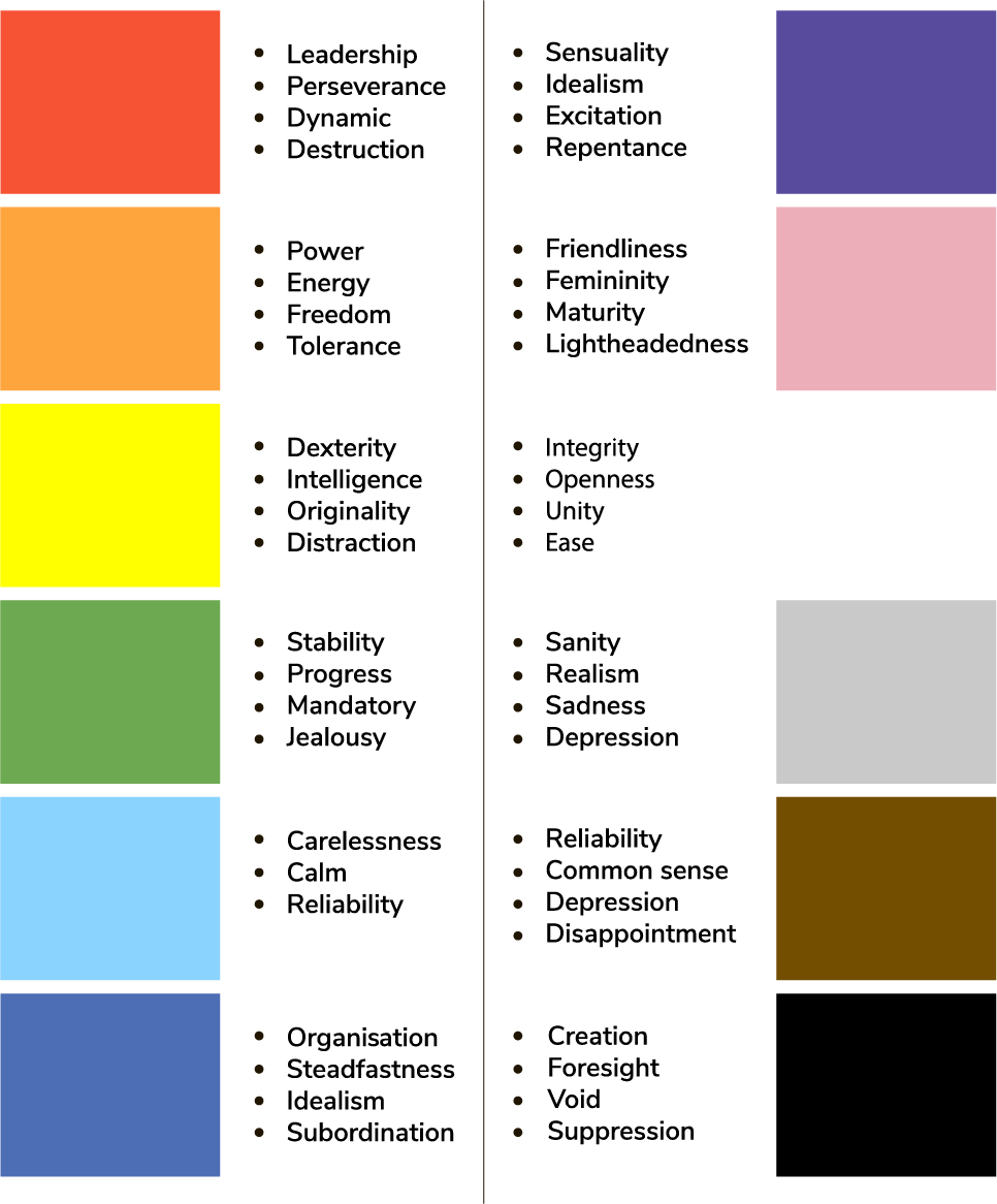
Colour
Colours have certain emotions and ideas attached to them, and the way they are used can have a dramatic impact on how your audience perceives your brand. One colour can represent two vastly different feelings (for example, green can reflect sickness or health), so it is important to consider the various interpretations of the colours in your crest.
Typography
There are four main kinds of font or typeface: serif, sans serif, script and display. In choosing a font, you will need to consider the use of open-source (free/shareware) versus licensed (commercial) typefaces. Your designer can advise you on costs and ownership as well as the availability of styles and execution in both print and web media.

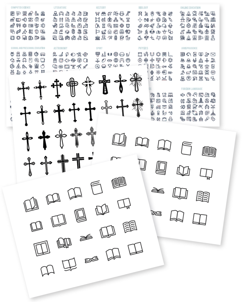
Design elements
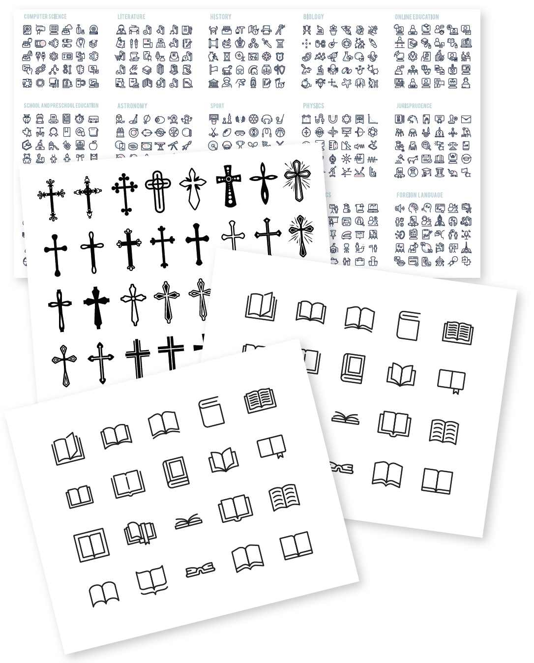
Design elements can convey your brand’s history, ethos or story and create credibility, even in brand new designs. School crests often include religious and/or education symbols, or those that reflect a school’s location or natural environs. When used wisely, they can be powerful communication tools, conveying in one image what it would take many words to say.
Conclusion
It takes time, discipline and effort to create a logo or crest that will do the work you need it to do. Don’t rush the process and you will be able to maximise the insights gained on the journey. Every aspect of your crest influences both the impression your brand makes on your community and its ability to stand the test of time. In the end, your crest may not resonate with everyone, but a careful, well thought-out design process is your greatest opportunity to bring your brand to reality.
Remember, your crest should reflect your brand … not the other way around.
insight applied
- Engage a designer at the start of the process.
- Involve stakeholders as early as possible.
- Keep the approval process simple.
- Your crest should reflect your brand … not the other way around.