
A rebrand typically consists of a name, logo or logotype, typeface selections, colour selections and sometimes, a tagline. While not being the sum total of your brand, a rebrand has the power to influence – good or bad – how people perceive your school. For some established schools, a visual identity can represent a significant brand asset, so making the decision to change your visual identity or brand is a big decision and should not be taken lightly.
A rebrand will create real, lasting value when you want to signal a change to the market, or, inconsistent application of your visual identity is damaging your brand.
Years of listening to clients’ frustrations with their marketing communication efforts tell us that clients experiencing the following conditions will benefit from a rebrand:
1. Frustration stemming from the school ‘not looking good’
You notice it, and you know others do too. From stationery, to signage, to the website – your visual identity is inconsistent, unfocused and haphazard. Compared to your competitors, it lacks discipline and is damaging your brand.
2. The visual identity has fallen victim to internal sabotage
Well-meaning staff, in the absence of any style guide to direct them, are stretching the logo beyond its safe use, using non-conforming fonts, applying different colours to the logo, and the list goes on. Non-conforming brand elements need to be reined in and brand impressions standardised.
3. Support a strategic direction to renew the school
You’ve made the decision to renew and rejuvenate your school. The visual identity needs to change to reflect the new direction and invite families and prospects to take another look.
4. It’s not about the logo
Your logo works – in fact it is a significant brand asset. What it needs is a more tightly defined contemporary application that honours the history of the school, but doesn’t constrain you by the past.
Here are some common branding mistakes schools make:
- Using multiple logos
- Using multiple taglines (or no tagline at all)
- Lack of consistent brand elements
- It’s just plain boring and bland
- Using a designer ‘wanna-be’ or parent volunteer to create your brand
- Using poor photography
- Letting everyone brand what is right in their own eyes
However, none of these mistakes have been as big, or as costly as those made by some of the world’s biggest companies. Here’s why schools should keep rebranding simple:
Pepsi

Pepsi is no stranger to logo designs, having changed its logo multiple times. In 2008, Pepsi released the latest iteration of its logo, rotating the circular icon and incorporating a smile into the design.
It wasn’t received well, with many noting they could not see the smile that had been incorporated.
The cost of rebranding is said to be $1.2 billion over three years, with the logo mark for Pepsi alone costing $1 million.
Tropicana
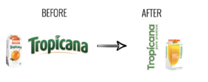
So if Pepsi isn’t renowned for its rebranding efforts, it appears neither is Tropicana, another brand of PepsiCo.
This rebrand was said to have lost the identity of Tropicana, the exact opposite objective of a rebrand.
Terrifyingly, sales figures revealed sales of the Tropicana Pure Premium line plummeted by a significant 20 percent. On the revelation of the figures, PepsiCo reversed its decision to rebrand and reverted the carton design to what they had originally.
It is estimated the move cost Tropicana approximately $137 million in sales between 1 January and 22 February.
Kraft

When Kraft launched its new logo, it took just six months for it to revert to the previous version due to stark criticism from the design community.
No figures were available for the cost of the rebrand.
Gap
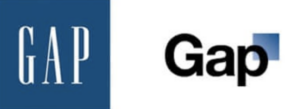
Gap performed possibly one of the fastest branding turnarounds of all time when it reverted to its original design, just six days after putting the new logo out publicly.
The Gap rebrand was estimated to have cost $100 million.
BP
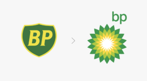
The Helios logo is meant to symbolise and represent the company’s green growth strategy by taking on the form of a sun. However, there is nothing green about drilling oil, particularly when the same company is responsible for what is considered the largest marine oil spill in the history of the petroleum industry – the Deepwater Horizon oil spill.
The cost of the Helios logo design and it’s rollout was rumoured to be $211,000,000.
Rebranding can be pretty scary. If you’re considering a rebrand for your school but don’t know where to start, we’re here for you, so schedule a time to talk.